design

Salty Spruce Photography Studio Rebrand

I took a hiatus from blogging but I am happy to be back and sharing new work.  Last fall I worked with the lovely Melissa from Salty Spruce Photography Studio to rebrand her business and help her identify her ideal clients.

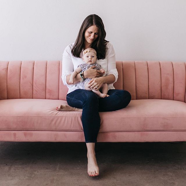
As we worked through the answers of her survey I start every project with it became clear her two ideal clients she loved working with were the adventurous couple who wanted a small intimate wedding or elopement and the creative entrepreneur who wanted branded images for their website and social media channels to match their personality.

Colorado Photographer Moodboard

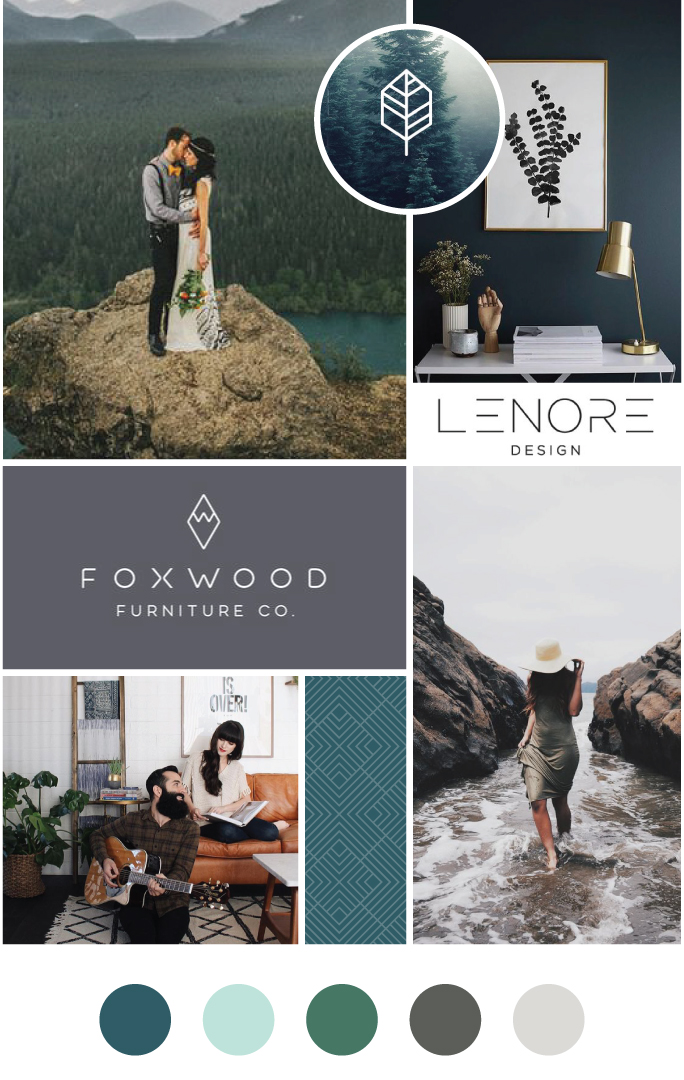
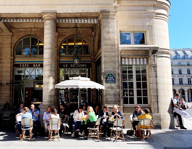
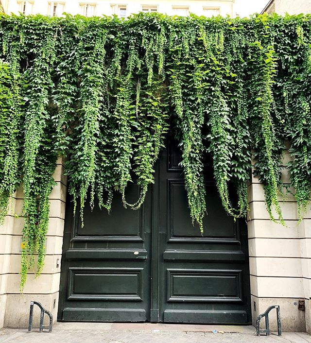
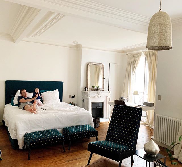
The first step in the process was to design a mood board that helped establish a look and feel for her brand.  Melissa named her business after her two loves, the ocean and the mountains.  Having grown up going back and forth between Colorado and the North Carolina coast her ties to both are strong.  She expressed to me she wanted a mix of natural elements mixed in with modern architectural lines and a color scheme that was both moody but still light.  

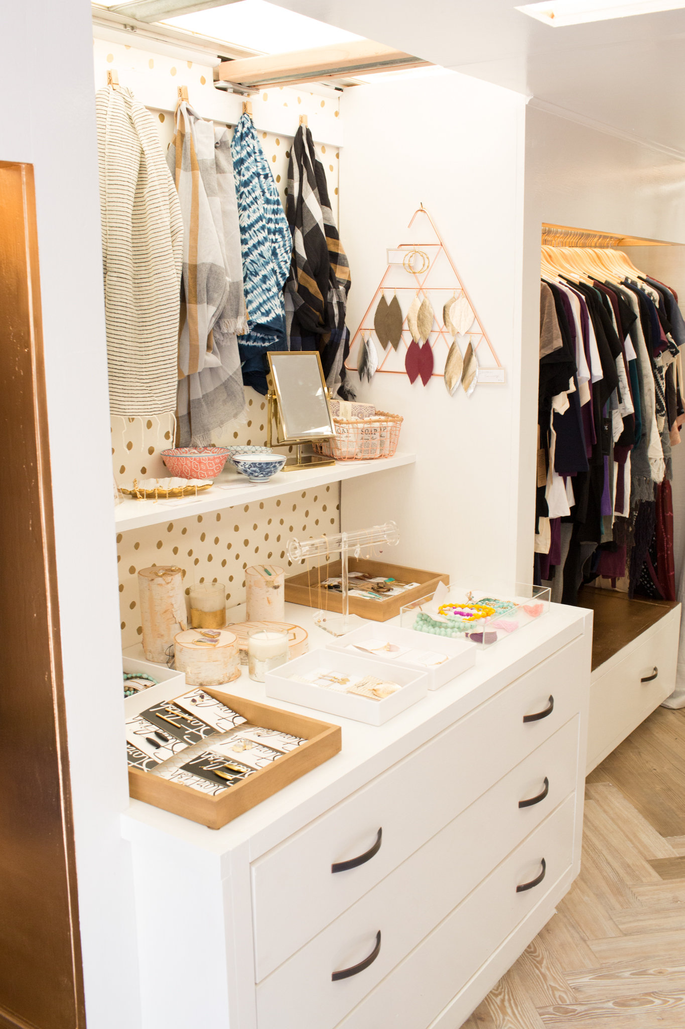
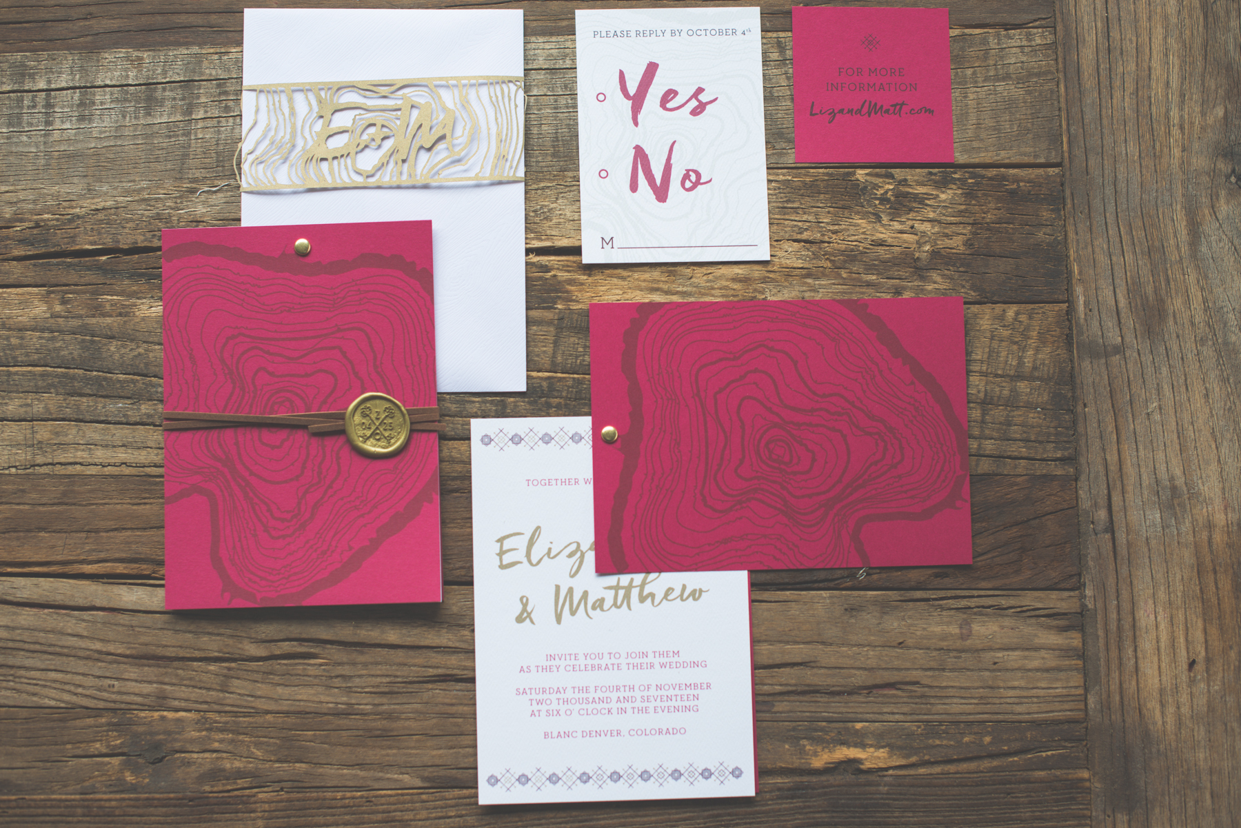
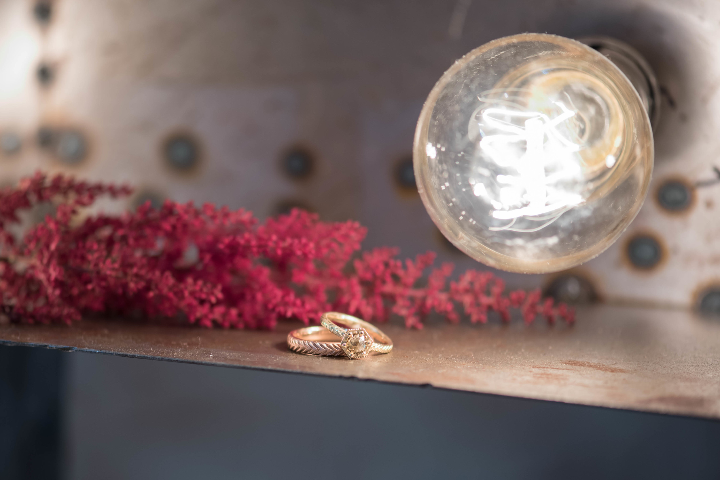
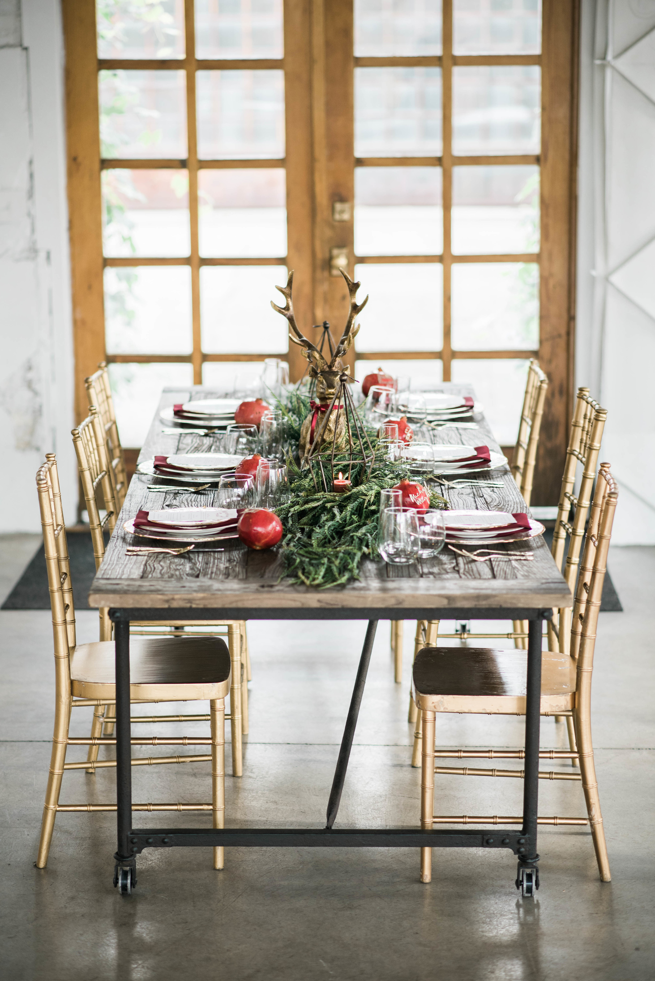
I tried to represent all these elements into her mood board including photos that represent her two ideal clients, modern architectural design with natural elements, the sense of adventure her ideal clients might seek and the beautiful space her ideal clients may work in.  When I design a mood board for a client like to ensure there is a reason for every photo I select besides the fact it is a pretty photo in the right color scheme.

Colorado Photographer Brand Design

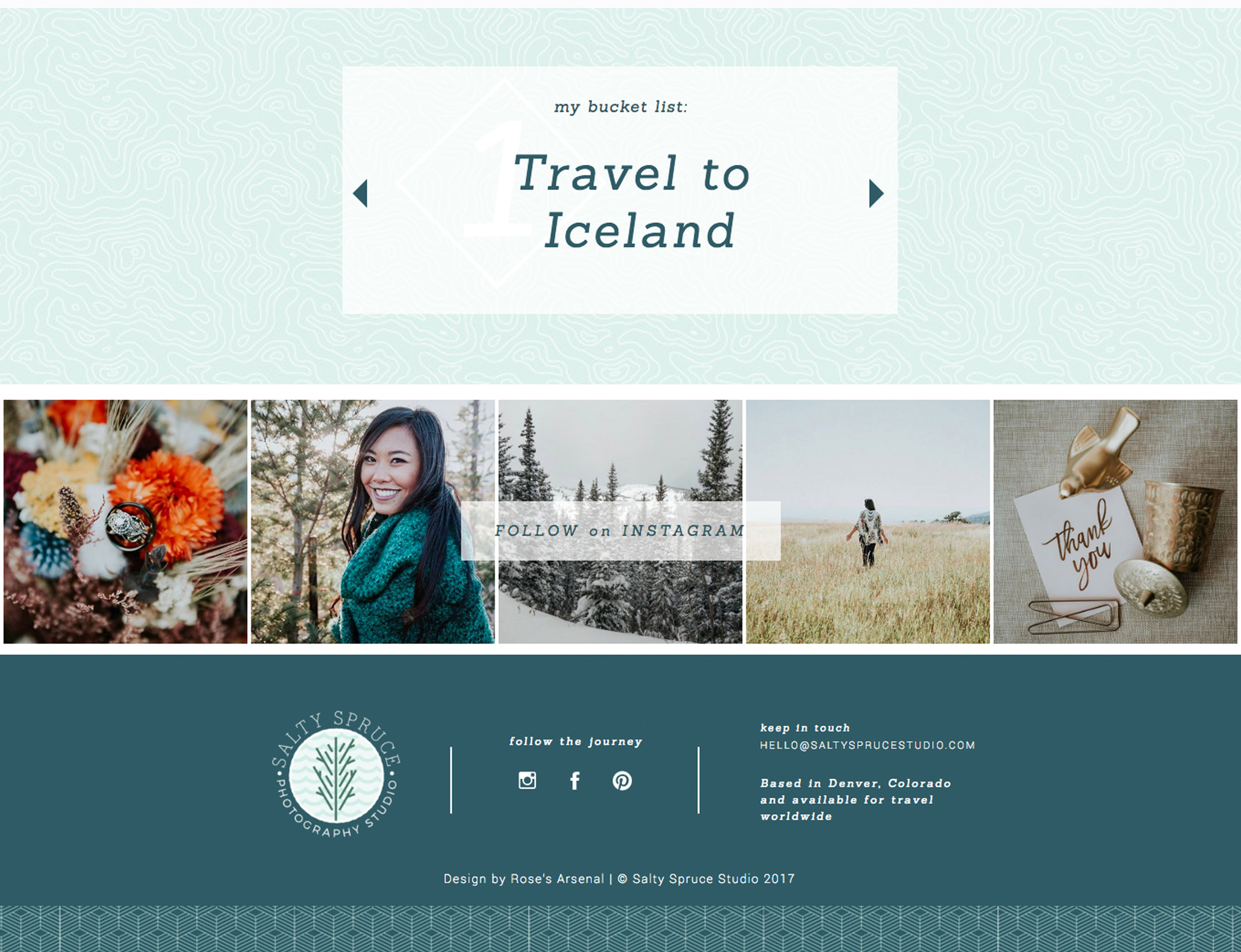
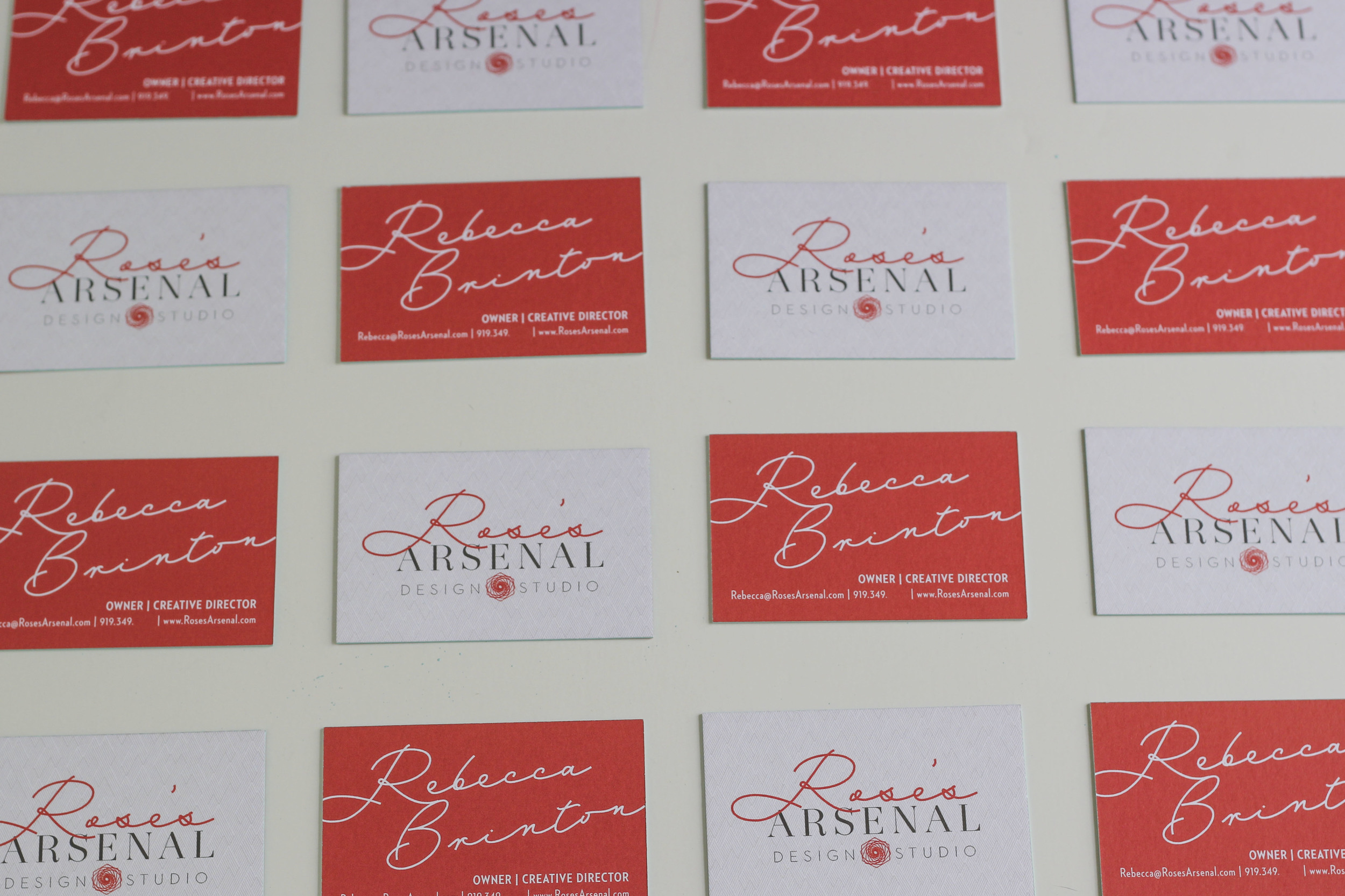
After we finalized her mood board we moved onto designing her logo and brand elements.  The logo option she chose has a modern line-drawn tree with wave elements to represent her ties to the mountains and coast and pull in the architectural but natural look she wanted.  The two patterns are a modern line pattern meant to look like mountains or waves and a topographic map pattern to represent the adventures and travels of her and her clients.

Colorado Photographer Business Card Design

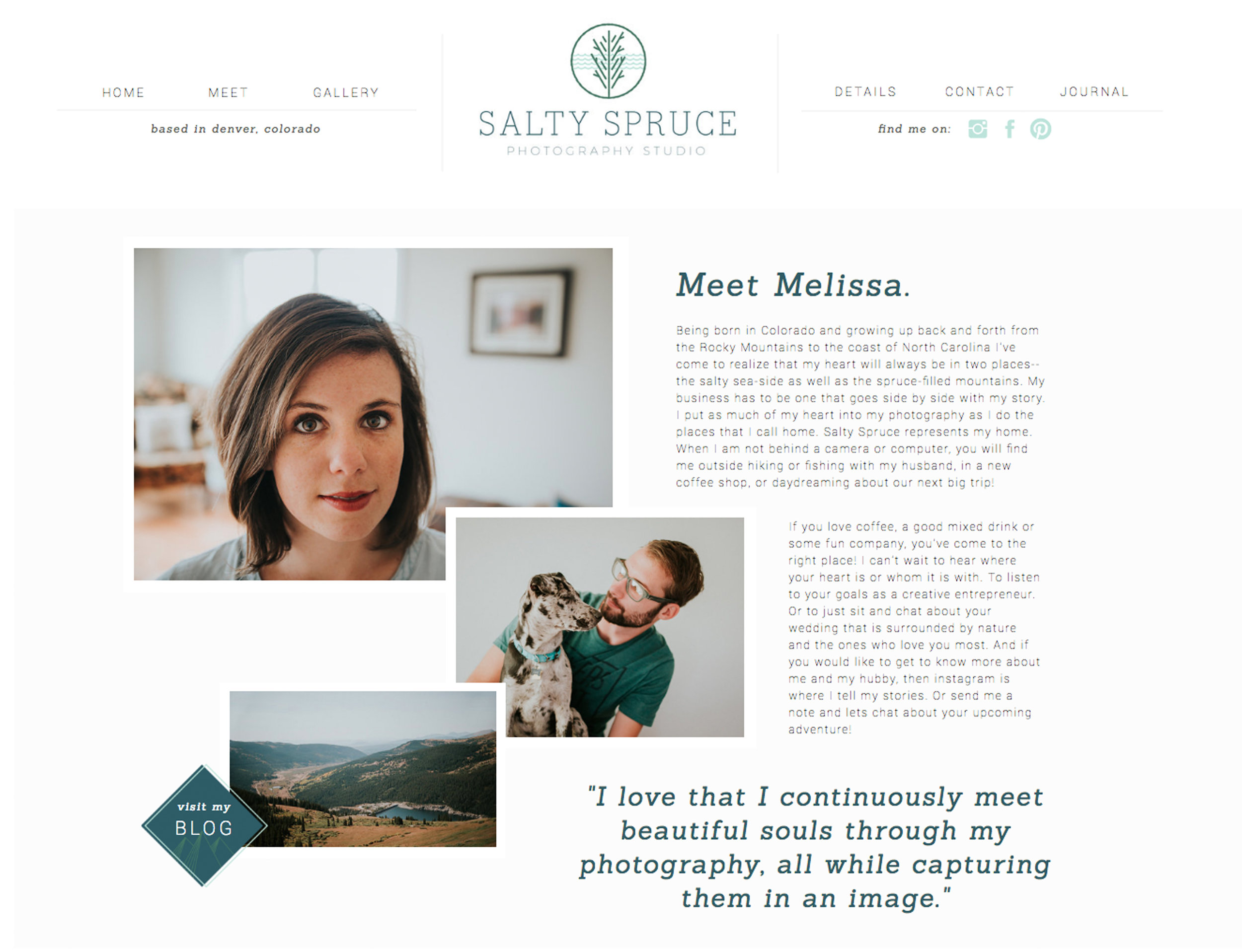
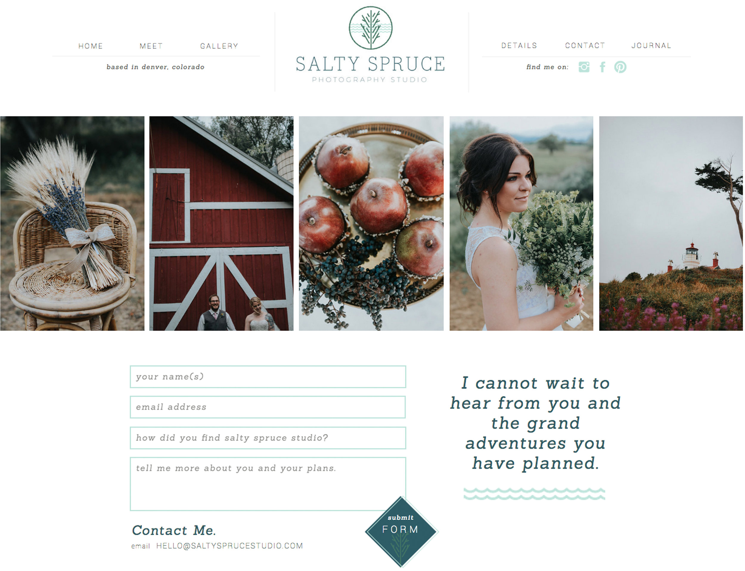
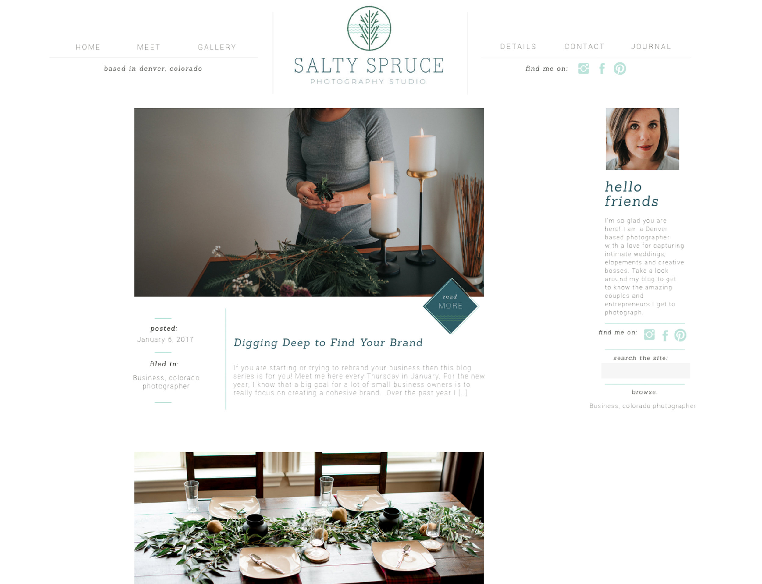
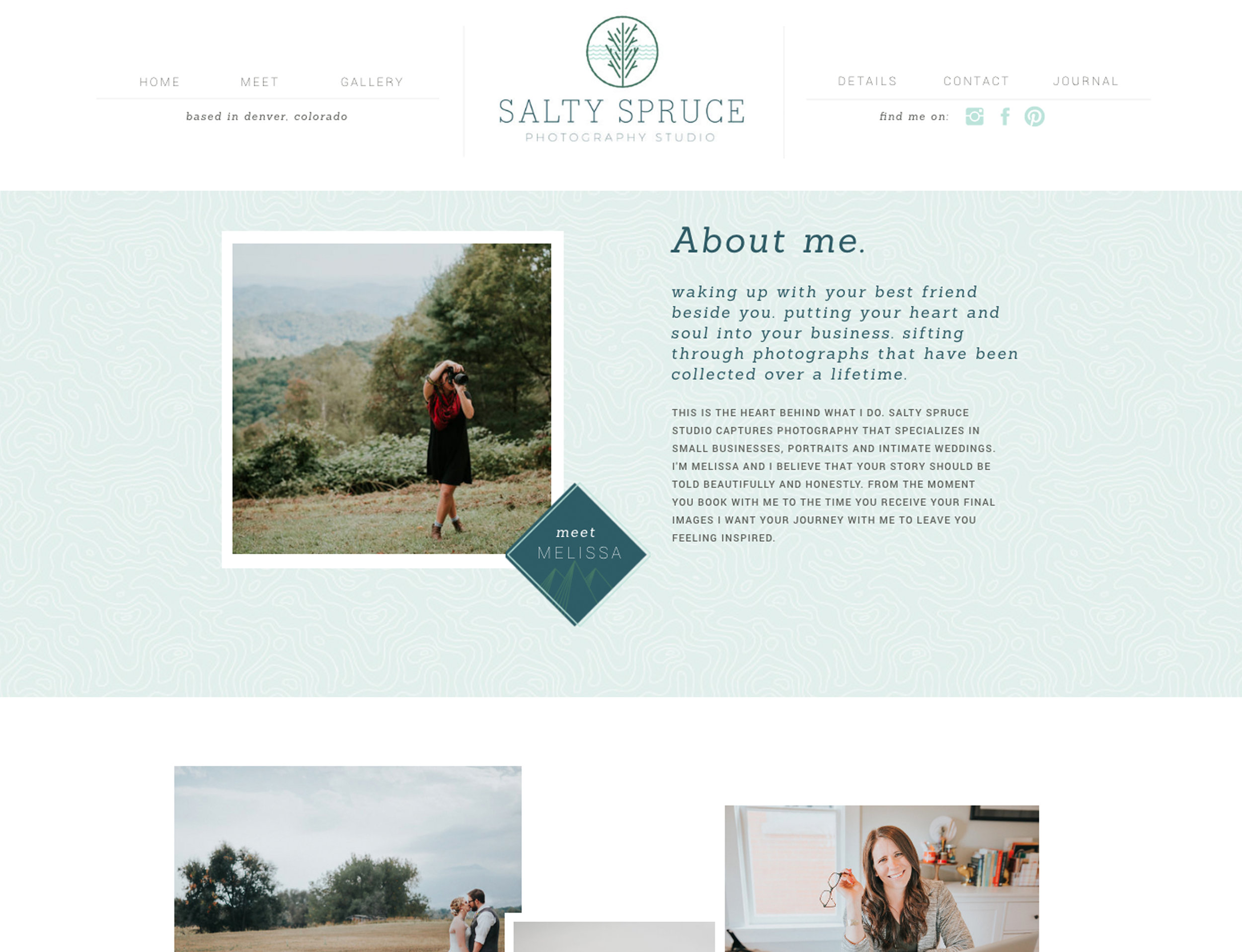
The final piece of the puzzle and my favorite part was her website design.  I wanted to include design elements and patterns that really help tie the brand together but I also wanted Melissa's beautiful photography to really shine.  

Colorado Photographer Website Design

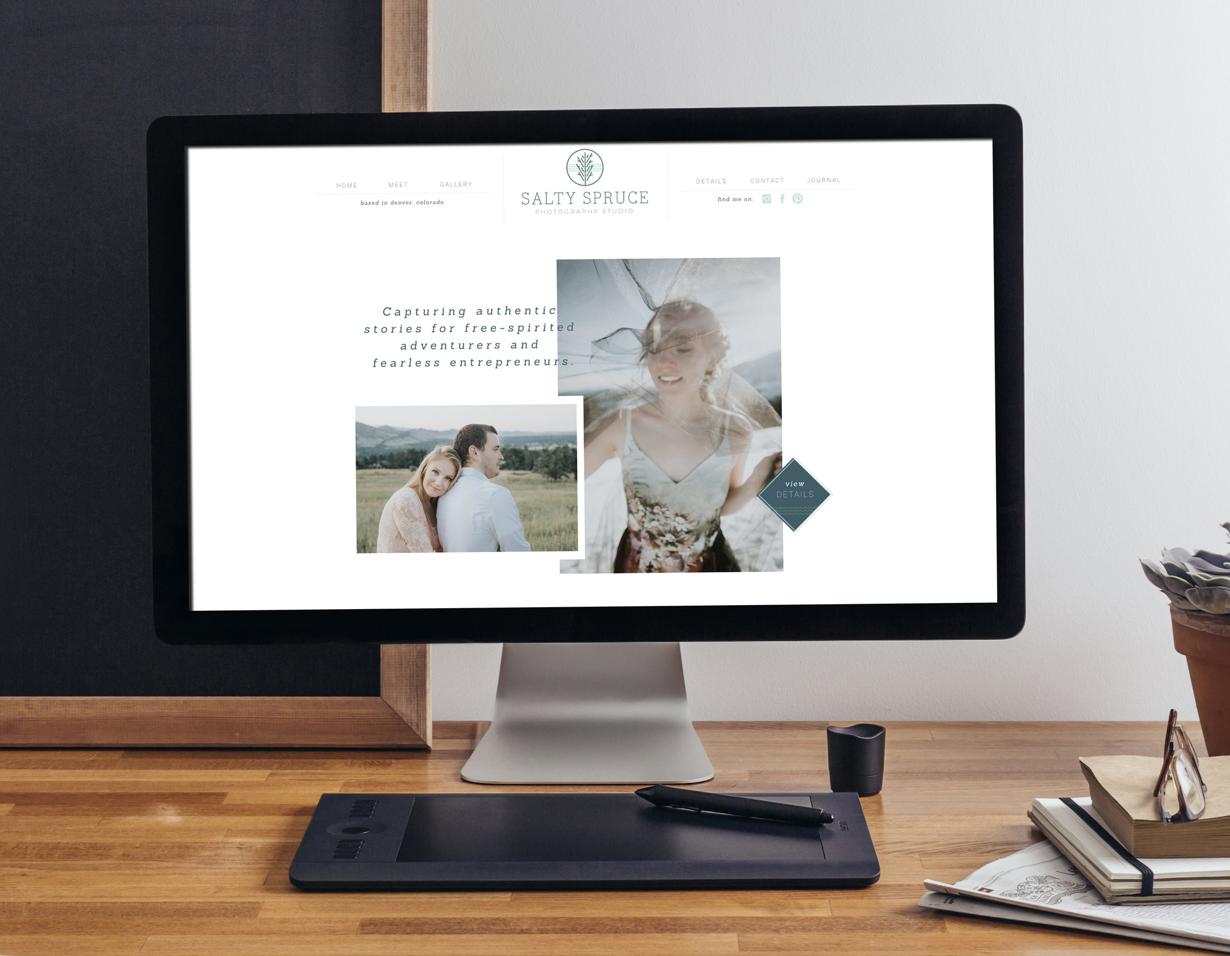
A few screenshots of her site design are below but I urge you to peruse her site yourself by visiting www.saltysprucestudio.com.  Especially if you are in need of a photographer for your business or wedding!

And if you are a small business owner either in need of a rebrand or you want to take your business to the next level by reaching your ideal clients with a unique brand, I'd love to chat!  I offer free 15-minute intro calls to discuss your needs and get to know each other before committing to a package.  There is no better way to start out the new year than to set your business up for success with a well designed brand and website.  Fill out my contact form here and I can't wait to chat with you about your business!

Woodend Wedding Invitations

Maureen and Tommy were such a dream to work with and I loved creating everything for their Woodend wedding from their logo to the day of beverage signs and everything in between.  Since they were getting married outside they wanted to tie in the nature aspect with a gold and navy color scheme.  Maureen loved the eclectic look so I designed each piece to be an individual design yet all tie together.

While the bride wanted to tie in metallics we didn't want to do anything as bold as foil so we settled on printing offset where the ink gives a nice shimmer but still ties into the natural look they were going for.

For the day of designs we tied in patterns similar to the invitation for the beverage menus, buffet labels and escort cards.  This helped bring the entire look together for what would be a beautiful wedding.

The Flourish Market Branding

This past fall I designed the branding for a friends ethical fashion truck and it was such a dream project to work on.  The Flourish Market is a fashion boutique and mobile truck spreading dignity around the globe.  They partner with companies who provide dignified jobs and fair wages to artisans and makers in vulnerable communities and I highly recommend checking out the beautiful products they sell.

When Emily came to me with her concept she wanted a brand that communicates a girly wanderlust feel with a sophisticated handmade look to represent the artisans whose work she sells.  

I developed a world map graphic with hand drawn patterns as a nod to the handmade products she sells.  She already had her color palette of black, blush and gold selected but I tried to strike a balance of girly but sophisticated.  

I love how this project turned out and I probably own half of her products as I've in turn become a loyal customer of the beautiful goods she sells.  If you live in North Carolina you need to check out her truck schedule as it is such a fun shopping experience with a great cause.

Holiday Styled Shoot

I loved working with Melissa from Blink Photography on this styled wedding shoot where the inspiration was berry colors and a touch of holiday.  The Blanc Denver was the perfect venue to provide a modern blank canvas for the slightly rustic but glamorous decor.  This shoot is the perfect inspiration if you are looking to get married around the holidays but don't want it to be over the top holiday themed.

I designed the place cards below to be die cut names attached to pomegranates to help add a pop of color to the table.  Place cards are a great way to think outside the box and have do double duty by incorporating them into your table decor.

The invitation was designed to fan out with a patterned folder in the pack holding the RSVP card and information card.  It was all tied together with suede and a wax seal.

The favors were tree saplings for guests to take home and plant.  I designed a sign to look like a slice of wood to attach to the favor basket.

VENDORS: Photographers: Blink Photography Inc and Stephanie Ramsey Photo Florist: The Perfect Petal | Rings: Kristin Coffin | Furniture: Colorado Party Rentals | Venue: Blanc

Business Card Edging

When I redesigned my brand earlier this year the item I was most excited about designing was new business cards.  I ordered beautiful double thick cards from Moo but the basic edge colors they offered did not match my brand so I of course decided to do it myself.  

The problem was I couldn't find the right tutorial that worked and ended up having to go through a series of trial and errors.  Luckily I finally had success with acrylic paint and since many of you have asked how I did it I thought I'd share this tutorial with you. 

Materials:
Clamps 
Acrylic Paint in the color of your choosing
Foam Paintbrush
Thick Business Cards (It is important the cards are on thick paper or the color won't be visible)

1. Start off by stacking a few inches worth of cards and clamping them on both sides.  You'll want a junk card on top and bottom that you are willing to sacrifice as they will get paint all over.  I use the same junk cards with each round I do so that I don't waste too many.

It is important to get the cards lined up as perfectly as possible.  Make sure the clamps are tight but not so tight they buckle the cards as you don't want paint getting in the sides.

Tip: At first I had trouble lining my cards up so I just used one clamp and pushed the cards against the bar as a guide.  If you do this you'll need to release the bar and turn the cards to fully paint them and I recommend applying pressure to the end without the clamp to prevent any paint from getting in the side.

2. Next you paint all four sides with acrylic craft paint in a color of your choosing.  A lot of the tutorials I saw online recommended spray paint but spray paint was a total disaster for me and got in all the edges.  I found acrylic paint was a lot easier to control.  

Tip: Make sure you aren't getting any clumping of paint, especially on the corners.

IMG_8345_1.jpg

3. The paint will dry quickly so you want to separate them when they are almost dry but not quite so that they don't stick together.

4. Lay them out to finish drying before stacking them again.  

5. And voila you have beautiful edge painted business cards that will impress your clients and colleagues.  

Disclaimer: I will say even with this method I did still get a few cards where the ink leaked.  I tried several different approaches though and this one gave me the best success and most control over the ink.